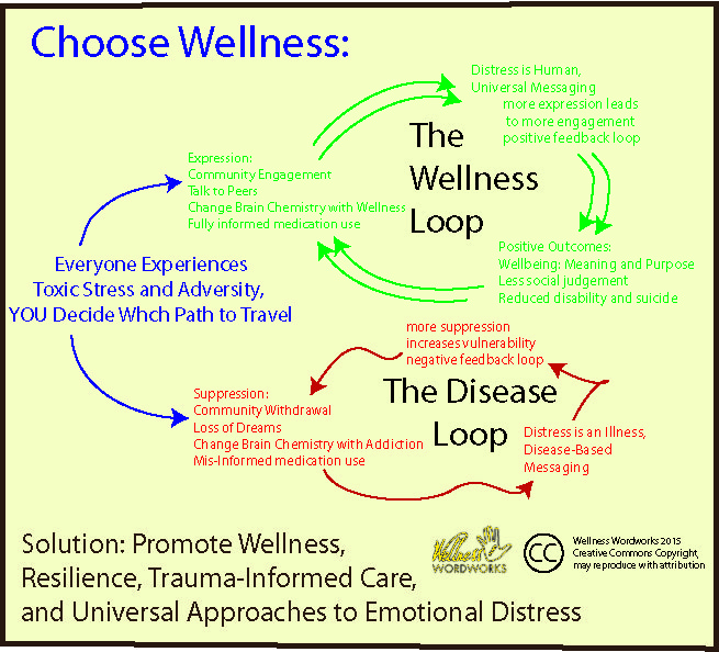
I have been creating graphics to explain some of the work we do. Infographics have a lot of power. This one is a rough draft, there are still too many words on it. It needs more pictures and less words, and some sources for verification. But sometimes images are worth 1,000 words, and I wanted to share this one with you to get a conversation started on how to represent some of the concepts we are sharing. This infographic explains some of the problems of the disease model. (Please stop saying medical model – our model has more science and medicine on our side than the old school approach does.)
Feel free to download, modify, or share as long as our logo stays attached to the image.


This is sooo smart and informative Corinna. Hope the talented readers of MIA start sending in the graphics!
Report comment
I don’t want to be the grammar police but correcting the spelling could help (whch) ;P.
Report comment
I love this, it’s very clear. If we believe in our own wellness, then we can choose that path. Aside from it being a choice, I also like how you illustrate with such clarity the self-perpetuating nature of each path. Perfect.
Report comment
Lovely Corinna
A picture is worth a thousand words. We can see difficulty as a signal to transform – but we definitely need to ditch the disease model.
Report comment
Corinna, I love this. Very clear and helpful. The only thing I wonder about is the centrality of changing brain chemistry and how that may, for some, tie into the “chemical imbalance” myth. Are there maybe other sorts of changes to include? I hope that does not seem critical–I really like it very much!
Report comment